Putting Human Experience on the Map

In our daily comings and goings between home, work and school, the streets and bike paths we choose to navigate are also an emotional map of our commute. Where do we consistently experience frustration with traffic? Or anxiety from a tricky intersection?
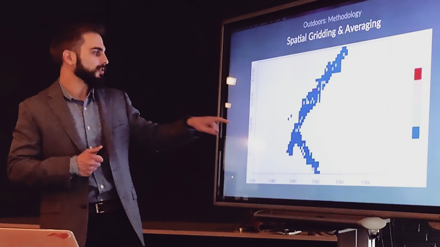
To Garrett Millar, Ph.D. candidate in NC State’s Geospatial Analytics doctoral program, mapping the locations of strong emotions is a powerful way to help improve the human experience––by helping decision-makers identify where environments inspire either calm or stress.
Millar earned a bachelor’s degree in Psychology from NC State in 2016 and immediately dove into doctoral work. At the Center for Geospatial Analytics, his research has shifted from “seeing how people interact with technology,” he says, to “using technology to see how people interact with the world.” A large part of his dissertation has focused on creating interactive spatial tools that reveal the environmental context of human emotion.
“Human emotion is a very complex phenomenon and extremely hard to pin down and measure,” Millar explains. Spatial data provide a quantitative way of understanding the deeply important context of emotions, he says, and the environmental stimuli that spark them.
By developing interactive geovisualizations that pair physiological data with detailed maps, Millar is “helping to better understand why people are having particular experiences” in specific places.
Understanding cyclists’ stress with Stress3d
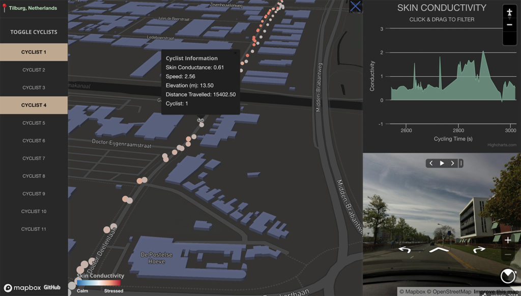
One part of Millar’s doctoral research has involved creating an interactive online mapping application called Stress3d, which will help transportation planners in The Netherlands design or modify bicycle highways to minimize rider stress.
Millar began his work on Stress3d in Faculty Fellow Josh Gray’s GIS 713 “Geospatial Data Mining and Analysis” course, using a dataset provided, at Millar’s request, by the Experience Lab at the Breda University of Applied Sciences. At first, “there was a huge learning curve” to working with the Experience Lab’s data, Millar says, “but the most exciting learning curve there could be, because I was mapping what people felt, where they felt it, and trying to infer why.”
When he shared a preliminary analysis with Experience Lab researchers, “they liked what they saw,” Millar says, and they invited him to spend several weeks working onsite in The Netherlands to expand the application and even create another.
The Stress3d application Millar created interactively displays data for a two-hour bike ride between the cities of Tilburg and Waalwijk, with data points from twelve bicyclists equipped with wearable sensors and a GoPro camera.

“There are physiological indicators that can be used to infer whether a person is feeling an emotion and how strongly they’re feeling it,” Millar explains. The dozen bicyclists in Stress3d’s dataset wore a device similar to a smartwatch to measure changes in a small electric current passing through the sweat on their skin. These measurements of so-called “skin conductance” are commonly used in psychological research to detect spikes in sweat production (and, by proxy, stress).
“The tricky thing with physiological data, though, is that you could have the most perfect data––highly accurate measurements of physiology and of location––but the context is always a bit cloudy,” Millar points out.
To solve that problem, Stress3d provides street-view images of the environment around each data point along a cyclist’s journey––essentially allowing researchers to visualize what each cyclist was seeing when they experienced stress.
The approach can help inform road redesign plans, Millar says, by quantifying both negative and positive reactions. If many cyclists experience stress at the same location, their combined experiences may indicate a particularly problematic stretch of highway. In contrast, an area that elicits consistently positive responses might have characteristics that should be replicated elsewhere. Users of Millar’s application can zoom in to the cyclists’ line of sight to identify any problems (or pluses) and devise strategies to fix (or learn from) them.
Mapping excitement for art and more
Millar’s collaboration with the Experience Lab has since expanded to include additional spatial explorations of physiological data––tracking the emotional responses of museum-goers as they wander through art exhibits. To help staff at the Vincent Van Gogh Centre in Nuenen consider a museum redesign, Millar built a digital 3-D model of the building, overlaid with skin conductance data from visitors, creating another interactive online map he dubbed Emotion Museum. The application will help museum staff understand which exhibits visitors find most exciting, and therefore which might be best to feature, without needing to conduct a detailed survey.
Millar has also started working with researchers at Harvard Medical School to help them leverage the use of wearable sensors (specifically Fitbits) to track the well-being of healthcare workers. The project is part of the extensive Nurses’ Health Study, conducted in partnership with Brigham and Women’s Hospital, which has been investigating risk factors for major chronic diseases since the 1970s.
“People don’t exist without their environment,” Millar explains. Understanding that environment is therefore key to understanding, and optimizing, emotional and physical well-being.
“If we can figure out how we respond to the environment,” Millar says, “we can figure out a better way to live in it.”
This post was originally published in Center for Geospatial Analytics.
- Categories:


